
TODO App Design
As an international student, I always crave some chances to participate in fun events happening in Toronto. I always wanted to explore a new culture so that I could take advantage of being a student abroad. The problem is that I couldn’t find the appropriate events all the time. Some events are outdated and some are just not what I wanted. How can I find the events going on in Toronto easily? This question was the starting point that I branded the app “TODO”. I would like people to find the event they want to participate it easily and also acknowledge new events quickly. Before deciding to develop the app, I conducted the several research to find out the best way to inform people about the events.
Roles
UX/UI Designer
Problem
Create an event recommendation app that navigates people to find events they like
Solution
Send five event cards every day and it helps recommend customized events in the future
Users
Torontonians who are looking for events that perfectly fit for them
Research
Psychographics
Our audience is the Millennial generation who was people born between 1980 - 2000. This generation is extremely comfortable with mobile devices but 32% will still use a computer which means web pages for purchases. Based on this, we can say mobile application would be a wiser choice than creating a website and adding another event application on their phone would have lower entry barriers than other generations.
Moreover, this generation is the most responsive to recommendations from friends and family, and decides where to eat based on Instagram pictures, and chooses hair stylists from Facebook. This means we can consider having a recommendation feature or spread words feature in which users can give the event information to friends they want to share.

Competitors Profiling
Eventbrite
Good things about the app are that they are frequently updated with new events and has a great search feature. You can get recommendations, register for events and even securely purchase tickets all through this app. However, they have a lot of marketing events as well users wouldn’t be interested in.

All Events in City
Different from Eventbrite, it’s more focused on events finding fea- ture. If you select your interests to get personalized event recommendations, you can RSVP to events you’re attending and even see where your friends are going. This app has many local events with detailed information based on your location. However, the information is not comprehensive and their search and recommendation features are redundant so that they show the same results from different approaches.

Gravy Events
It provides happenings based on your location or calendar date. This app used to have a special feature to recommend the events based on your mood but it’s deleted at the moment. It’s pretty similar to other event finding apps but it uses the hamburger menu as navigation which could be confusing to users and the search feature is not customized for users.

After using all three apps, I could get some inspirations about which features should be included. First of all, the future app may have the landing page customizing users’ interest and the app has the navigation bar at the bottom which has three features including home, search, and profile sections. In search section, users can leverage the map feature where they can see the current location and look for events based on their location. When users see the event information, they will be able to see the reviews from others and they can spread word sharing on their SNS accounts.

Unstructured Interview
After several interviews, I found interesting inspiration to be taken care of. First of all, most of the participants don’t use the application or website to find events to go. They even don’t know there exist some applications for event finding. They usually come across events from friends and on SNS channels. Secondly, the most used SNS platform is Instagram when finding events. They said the medium really doesn’t matter and if there’s an application to help them find interesting or useful events, they’re willing to use it. The most interesting part is that they sometimes don’t go to events just because they don’t have a company to go with.

A/B Testing
Before making the prototype, I should’ve decided if those features would be also compelling to users. So I utilized A/B Testing as a tool since it’s great that we can let people choose the best option between two rather than having many different ways.
The first question was about whether users like having landing pages before home page for the customization. Competitors’ applications have the landing pages and a participant said it would be good to answer the questions so that they will get more personalized event cards.
The second question was about the layout of the homepage. I’d like to have the recommendation feature which will show only five event cards to users every day and I was not sure if it’s also inviting to users. Luckily, 90% of participants prefer option A to option B which is just a regular list of recommended events.
The third question was about the map feature I’d like to put inside of the search feature. In option A, people will see the list of events recommended under the search bar. In option B, people can see the map and their current location when they click the search button. 70% of people said they liked option B since it’ll be very helpful if they can see where the event is happening.
Mood Board
• Primary Colours: Emerald, Purple, and Orange
• Streamlined design elements such as rounded corner rectangular
• How to show the recommendation cards
• Search feature with a map

Wireframes
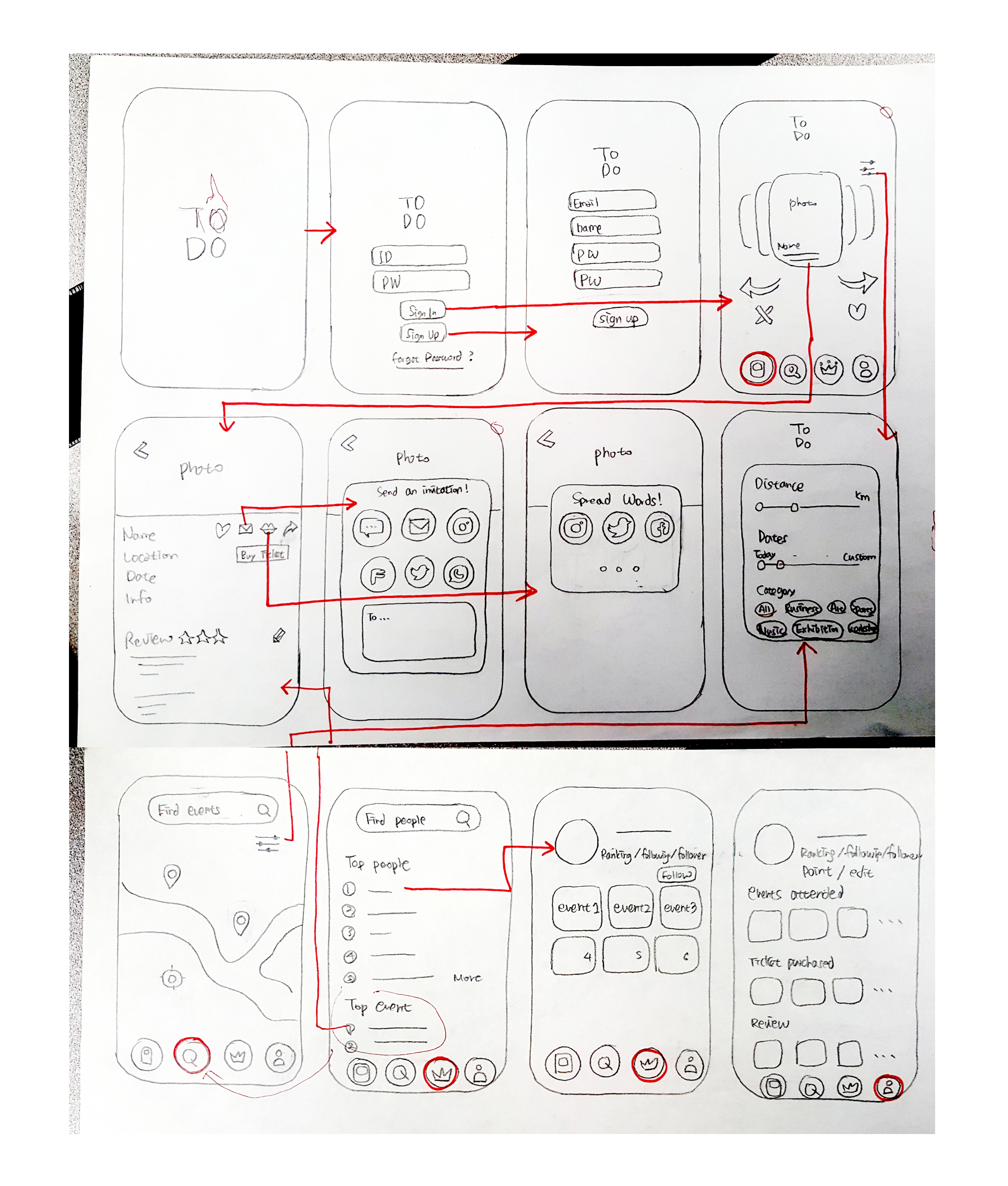
Feature
It includes three key features which are a home screen with event cards, a search bar with a map, and my profile page. The app has unique features including spread words and writing the review, which are both found on the event card. Users should be also able to purchase the tickets on the card. In the search section, users can look up events depending on their interests and locations. They also can check the most popular events. The user account and information can be managed on the profile section.


Screens

Lessons
As when creating an ALang app, I designed ToDo according to my pure instinct. As an international student, I’d love to explore Canada’s biggest city but there’re not many apps that meet my needs. While working on this app, I conducted three different research methods such as A/B testing, usability testing, and sketch. Especially when implementing A/B testing, it was very interesting to know which screen users prefer to. I’ve learned creating an app based on data is definitely more appealing and on point.
Contact
leh923@gmail.com